
Custom Boardroom Tables
October 26, 202610 min readWhere A Logo Belongs On A Custom Boardroom Table
A boardroom table with a logo works when the mark is sized, placed and cut for how the table is actually used. Here is how we decide between engraving and inlay, and where the logo goes.
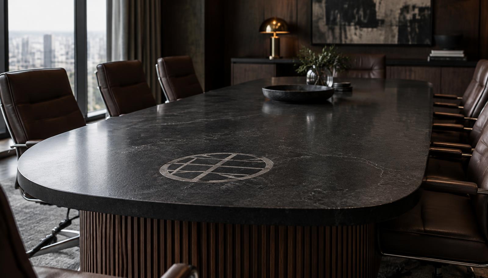
A boardroom table with a logo can look like a permanent piece of the company or like a trade show booth, and the difference is almost never the logo itself. It is the size of the mark, where it sits on the top, how it is cut into the stone, and whether anyone thought about what covers it during a normal meeting. A 30 inch emblem in the middle of a 16 foot top disappears under laptops by 9:05 every morning. A 10 inch mark set just inside the head of the table, where nobody puts a coffee cup, stays visible for twenty years.
We build branded tops as part of our Full Custom direction, where engraving and stone inlay sit alongside Schluter trim, LED and integrated power. This is how we work through a logo with a client, in the order the decisions actually get made.
Engraved Versus Inlaid Logos On A Stone Table
There are two main ways to put a logo into a stone conference table top: engraving and inlay. An engraved logo is cut into the surface of the slab, so the mark reads through depth and shadow in the same stone. An inlaid logo is cut out and filled with a contrasting stone or material set flush with the top, so the mark reads through color. Both are permanent, both sit flush or below the working surface, and both are drawn and approved before the slab is cut.
Engraving is the quieter option. On a honed black granite, an engraved mark shows as a slightly different texture and depth, strongest under low raking light from a window and almost gone under flat overhead light. That subtlety suits companies that want the brand present without it becoming the subject of the room. It also suits detailed marks poorly, because fine lines and small type lose definition when cut into stone, so engraved logos work best simplified.
Inlay is the louder option and the more architectural one. A light marble or quartzite set into a dark granite top, or a dark stone into a pale one, reads from across the room and on camera. The tradeoff is that inlay needs a cleaner shape. Every curve and point in the logo becomes a joint between two stones, and very thin strokes or tiny counters inside letters are difficult to hold. Most inlaid marks we draw are a monogram or emblem rather than a full wordmark.
Where The Logo Sits Matters More Than How Big It Is
Placement is the decision people underestimate. The center of the table looks right in a rendering with no people in it, and wrong in the meeting, because the center is exactly where documents, laptops, water and the conference phone collect. If the goal is for the logo to be seen, it needs to sit where the table is not used: inside the head end, at the foot facing the door, or on a waterfall panel where nothing can sit on it at all.
On a 16 by 5 foot rectangle seating 14, the head of the table usually has about 30 inches of surface in front of the lead chair before the side seats begin. A mark set 12 to 18 inches in from that edge, centered on the width, stays clear of the person sitting there and reads upright to anyone walking in from a door at the opposite end. If the main entry is on the long wall, the orientation question changes, and we draw the mark so it reads correctly from the door rather than from the head chair.
Vertical surfaces avoid the clutter problem entirely. On our Waterfall direction, a monogram inlaid into the mitered waterfall panel is visible from the doorway and never covered by paper. The same applies to a stone panel on the wall behind the head of the table, which you can see in some of the rooms on our projects page. When a client wants the brand on camera, that wall panel often does more work than anything on the top.
Sizing A Logo To The Table And The Room
A logo on a boardroom table should usually be smaller than people first ask for. As a working range, a mark between 8 and 14 inches across reads well on a top that is 4 to 5 feet wide, and anything over about 18 inches starts to compete with the stone itself. The slab is the expensive, irreplaceable part of the table. A logo that covers a third of its width turns a piece of quartzite into a backdrop.
Room size changes the answer. In a 12 person room where the far wall is 20 feet from the door, a 10 inch inlay is plenty. In a long Presidential room with a 20 foot top and seating in the high teens, a mark at the head can grow toward 14 inches because it is read from much further away. We test this in the rendering, at true scale and from the door, before anything is cut, which is the main reason renderings exist in our design and fabrication process.
- Top width 4 ft: mark roughly 8 to 10 in. across
- Top width 5 ft: mark roughly 10 to 14 in. across
- Waterfall panel: mark scaled to the panel height, with clear margin on every side
- Wall panel behind the head: can carry a larger mark because nothing sits in front of it
These are starting points, not rules. A tall narrow emblem and a wide wordmark of the same nominal size behave very differently, so we always size from the actual artwork.
Choosing Stone Combinations That Make The Mark Read
Contrast is what makes an inlay legible, and not every stone pairing has enough of it. A light marble inlaid into a honed black granite is the most legible combination we build, and it holds up on video because the camera sees it as a clean shape. A white quartzite into a charcoal quartzite is softer but still clear. Two stones close in value, such as a warm grey into a taupe, will look elegant up close and vanish from across the room.
Veining matters as much as color. A heavily veined marble used as the inlay will carry its veins straight through the logo, which can look intentional or can make the mark look broken, depending on the direction of the veins. When the top itself is a busy, dramatic slab, an engraved mark usually works better than an inlay, because the stone is already doing the visual work. Our materials page walks through the granites, marbles and quartzites we use and how polished, honed and leathered finishes change their character.
Finish affects engraving too. On a polished surface, an engraved logo reads clearly as a matte shape against a reflective field. On a leathered surface, the texture of the stone can swallow a shallow engraving, so we either cut it deeper or switch to inlay. On a honed surface, the result sits between the two, which is part of why honed black granite is such a common choice for branded tops.
Planning The Logo Around Power, Seams And Lighting
A logo is one of several things competing for the same top. Power and data cores, the seams on a long top, and any LED reveal all have their own positions, and they are drawn together. On a 20 foot top built in sections, a seam cannot run through the logo, so the mark is placed with the seams, not after them. Device cores are typically spaced along the seating positions, and a logo at the head end needs clearance from the first pair of cores so the cover plates do not crowd it.
Integrated technology is where this gets specific. If the table has a central AV connection for the display, it usually wants to sit near the head, which is the same territory the logo wants. We resolve that by moving the AV module a seat further down or by placing the logo on a waterfall or wall panel instead. Our integrated technology page shows how power, USB-C and data modules are set into the stone, and our power and AV planning article covers spacing in more detail.
Lighting is the last check. Downlights directly above an engraved mark flatten it, while light from a window or a wall washer across the top brings it forward. If the ceiling plan puts a row of downlights straight down the centerline, we would rather know that during design, because it can be the reason to choose inlay over engraving.
Artwork, Brand Changes And What We Need From You
The best starting file is vector artwork of the logo, along with a note on which version the company actually uses: the full lockup, the emblem alone, or a monogram. From there we simplify it for stone if needed, thickening thin lines and removing detail that will not survive the cut, and show the result in the rendering at real size. Nothing is fabricated until the client has approved the mark as it will be cut, not just the original artwork.
Brand changes are a fair worry on a table meant to last decades. A stone inlay cannot be swapped like a sign. Companies that expect a rebrand, or that are part of a larger group, often choose an emblem or monogram rather than the wordmark, since those tend to outlast logotype refreshes. Others keep the top plain and put the logo on a wall panel, which can be replaced without touching the table. Both are reasonable. What we try to avoid is cutting a tagline or a product name into stone.
We build branded tables for offices across the Valley, including Scottsdale, Chandler and Phoenix. If you are considering one, send us the logo file and the room dimensions, and we will show you the mark on the table, at scale, before anything is cut.