
Boardroom Design
September 14, 202610 min readBoardroom Design Mistakes That Show Up After The Table Arrives
Most boardroom design mistakes are not taste problems. They are clearance, seat spacing and power decisions made months before the table is built.
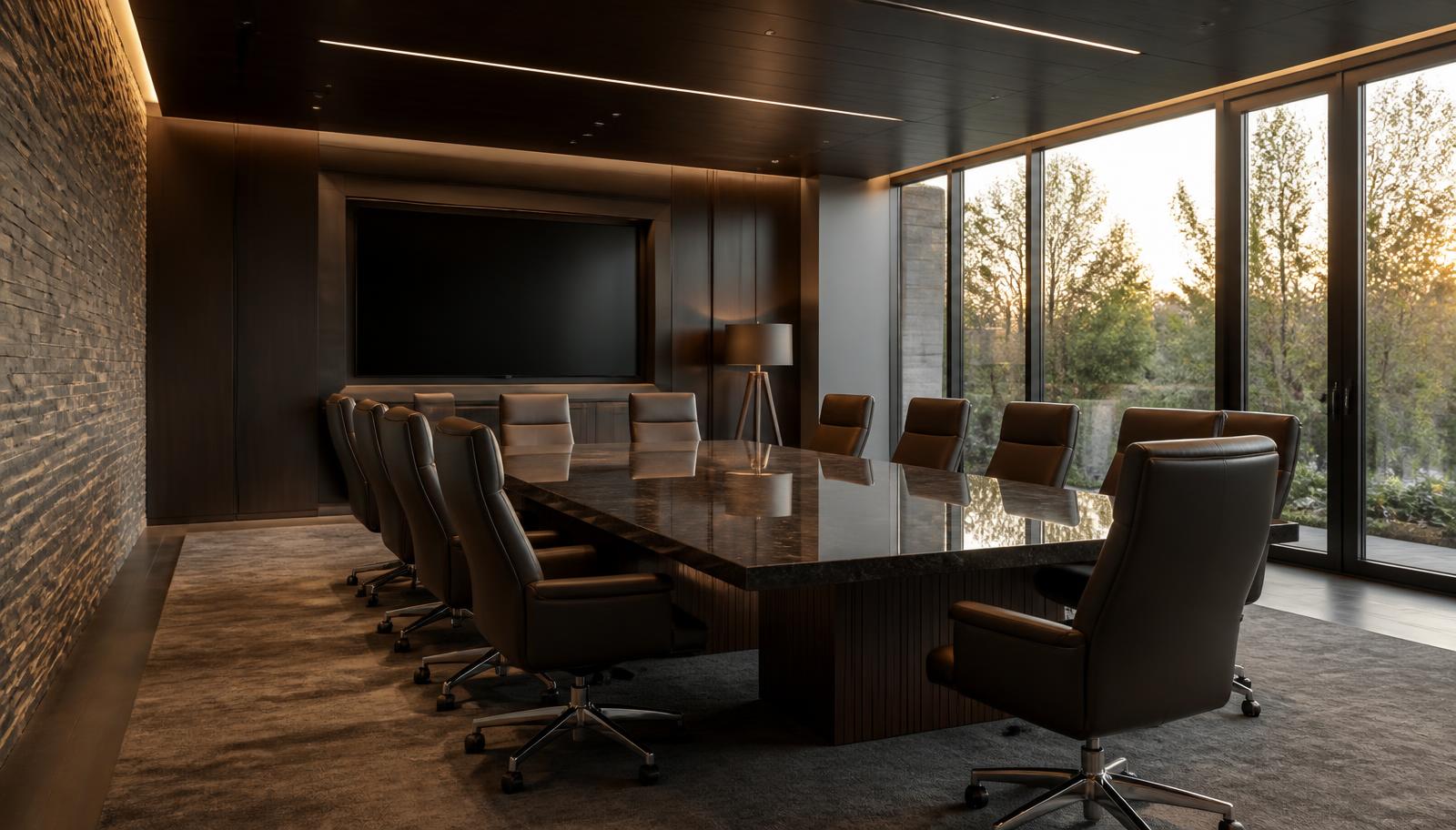
Almost every boardroom design mistake we get called about is a dimension, a clearance or a power decision that was settled early, on paper, by someone working from a catalog page instead of the room. Nobody notices on the drawing. Everybody notices the first morning chairs go in, someone slides back from the head of the table and hits the credenza. The six problems below account for most of it, and each one is decided months before fabrication starts.
Sizing The Table To A Seat Count Instead Of The Room
The room decides the table, not the wish list. Take the interior wall to wall dimensions first, subtract the clearance you need on all four sides, and whatever length is left is the largest top the room can actually carry. A 26 by 16 foot boardroom sounds like it will hold a 20 foot table. Once you take roughly 4 feet off each long side for pushed back executive chairs and a walking path, and 4 to 5 feet off each end so the person at the head can stand up, the honest answer is closer to a 16 by 5 foot top.
Working the other direction is where rooms go wrong. Somebody is told to seat 18, finds a 20 foot length that does it, and the table arrives an intentional foot too long. That foot comes out of circulation, which is the part of the room nobody measures and everybody uses. A table two feet shorter with proper clearance reads deliberate. A table one foot too long reads like a mistake, no matter how good the slab is.
The other dimension people forget is vertical and horizontal at once: where the display wall sits. The head of the table is almost always opposite the screen, and that fixes which end needs the extra standing room. Decide that before you fix the length, because moving the head of the table later moves the base positions, the power locations and the seat pattern with it.
Getting Seat Spacing And Width Wrong
Seat count is arithmetic, not opinion. Standard comfortable spacing is 30 inches per person along a side. Maximum spacing, the number you can fit for a full board meeting, is 24 inches. A 16 foot side is 192 inches, which is six seats at standard spacing and eight at maximum. Those two numbers describe the same table and two very different meetings, so decide which one you are designing for before you sign off on a length.
Width is the part that gets skipped. A 48 inch wide top seats one person at each end. A 60 inch wide top seats two. That single decision moves total capacity by two seats without adding an inch of length, and it also changes whether there is room for a laptop, a notepad and a glass in front of each person without anyone reaching into someone else's space. Custom widths from 3 feet 6 inches to 6 feet are routine, and 4 and 5 foot widths cover most executive rooms.
- Divide each long side by 30 inches for standard seating and 24 inches for maximum.
- 48 inch width seats one at each end, 60 inch width seats two.
- Count the seats the room needs weekly, not the largest number it could hold once a year.
- Check chair arm height against the apron, because executive chairs are wider than side chairs.
The full method, including which lengths from 12 to 20 feet seat which counts at both spacings, is in the conference table size guide alongside the size and seat count reference on the design directions page.
Choosing A Shape That Fights How The Room Is Used
Shape should be picked after you know where people look, not before. Rectangular seats the most people per square foot and reads formal, which is why it suits a long room where the meeting runs from one end. Boat shape widens through the middle so people on the same side can see each other, which matters in a room built around video calls where everyone has to be in frame and in eye contact at once. D-end softens one side and works where the room opens into a lounge or a window wall.
Square and round formats are the ones people dismiss too quickly. In a 16 by 16 foot executive room with eight regular attendees, a round or square top puts everyone the same distance apart and kills the head-of-the-table hierarchy, which is the right call for a working committee and the wrong call for a board that wants a chair position. V-shape exists for rooms designed entirely around a single screen.
Shape also drives clearance in a way that surprises people. A boat shape at 5 feet through the middle needs the same perimeter clearance as a 5 foot rectangle even though the ends are narrower, so it does not buy you room. What it buys is sightline. Confirm the format against the seat pattern and the camera position, then let the length follow.
Treating Power, Data And AV As A Later Problem
Power and data have to be decided before fabrication, because the cutouts are made in the stone and the chases are routed through the base while the table is being built. Retrofitting means core drilling a finished slab, and stone does not forgive that. The realistic alternative is a cord running across a polished granite top in the room the company shows to clients.
The coordination is not complicated, it just has to happen early. Power, USB-C, data and AV modules land between seats, not in front of them, so nobody has a port under their elbow. In leased space the floor boxes are already poured, so base positions get planned around the existing penetrations instead of asking an electrician to chase new conduit through a slab. On a 16 foot table that usually means two or three module locations tied back to one or two floor boxes.
Bring the AV integrator into the same conversation as the table drawing. Camera height, display size and the microphone plan all interact with table width and length. There is more on what can be built in on integrated technology, and the planning sequence is laid out in planning power and AV in a conference table.
Ignoring How A Long Top Gets Into The Building
A 20 foot stone top does not ride a passenger elevator, turn a tight corridor or clear a standard door. That is why long tables are built in sections and assembled on site, with the seams planned into the slab layout so they land where the veining can absorb them rather than through the middle of the most visible figure in the stone. Access gets confirmed during design, before anything is cut.
The measurements that matter are unglamorous: door width and door height, corridor turn radius, freight elevator interior dimensions and door opening, and whether there is a loading path at all after hours in a high rise. A 22nd floor boardroom in Phoenix or Scottsdale is a different logistics problem from a ground floor suite in Chandler, and both are solvable when the sections are drawn around the real path. Neither is solvable on delivery day.
Structure travels with that decision. Base spacing, substructure and knee clearance get resolved on paper so no seat ends up with a leg in it and a long span does not sag through the middle. The four stages, design, rendering, fabrication and installation, are on the process page, and long format rooms are what the Presidential direction was built for.
Picking Finishes And Lighting In Isolation
A table specified without the room's finish schedule tends to argue with millwork, stone wall panels and hardware that were selected months earlier. The fix is a specification exercise rather than a taste exercise: stone that agrees with the floor and wall finishes, wood that agrees with the millwork, metal that agrees with the door hardware. Polished stone reflects light and reads formal, honed is matte and hides daily use, and leathered adds texture that suits dark granite in a moody room. Bases in solid walnut or white oak, fluted or flat panel, get stained and sheened against what is already there.
Lighting is the half of this that almost nobody coordinates. Stone is reflective, so a downlight centered over a polished top lands a hot spot in the middle of the table and throws glare onto the screen at the far end. Fixture layout should be set against the final table length and position so light falls between seats and across faces instead of into them. If the design includes an LED reveal under the top edge or inside the base, that decision belongs in the same conversation, because it changes how much overhead light the room needs at all.
The rest of the room follows the same logic. Credenzas, side tables and lounge pieces can be built from the same slab and the same wood so the space reads as one commission rather than three purchases. Options are on materials, combinations are covered in the materials guide, and finished rooms across Scottsdale and the Valley are in our work.
Chairs are the last thing people budget and the first thing that exposes a bad decision. A large executive chair with fixed arms needs the arm height to clear the apron, and if it does not, every chair in the room sits pulled out an extra six inches, which quietly removes the clearance you measured for. Chair scale also has to suit the width: eight oversized chairs around a 4 foot top makes the table look undersized even when the arithmetic was right.
Approving A Table Without Seeing It Rendered
Signing off on a description is how proportion surprises people. A 5 foot width sounds generous until you see it drawn in a 15 foot wide room with chairs pulled out. A rendering shows the format, the base placement, the edge profile and how the veining actually lands before a slab is cut, which is the only point where changing your mind costs nothing but a conversation.
What to send is short: a floor plan or rough wall to wall dimensions, the seat count you need weekly, a photograph of the room, the display wall location, and the finish schedule if one exists. That is enough to come back with a format, a size, a material direction and a rendering. Send the room over and we will work back to the table.